PROJECT GOAL
Redesign the entire Zalando mobile apps for iOS/Android to be engaging, immersive and functional.
industry \ client
E-commerce \ Zalando
ROLE
Main senior designer to:
redesign the entire mobile applications from their interaction to visual design
define approaches, drive user research and deliver design specifications
all in close collaboration with 2 other designers and a team of engineers, products & researchers
team
A product owner
3 designers, 2 seniors including myself, and 1 junior
2 iOS engineers, 2 Android engineers, 1-2 back-end engineers
2 product managers
1 researcher
Design Process
The Zalando mobile apps back in 2016 had several UX issues that led to key redesign projects:
The main home section had a “WEB VIEW”, content coming straight from the web.
The user profile had serious usability issues with a long list of information and features without a hierarchy
The browsing experience was very poor with uninspiring product images, unintuitive navigation, and redundant product information
How they looked before the redesign
PROJECT GOAL 1 - REDESIGN THE MAIN HOME TO ELEVATE FASHION CONTENT
Form follows functions
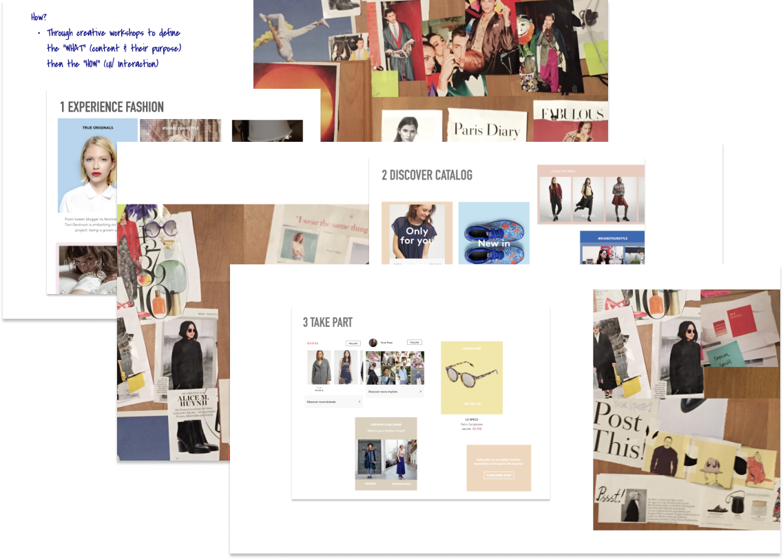
The challenge in this project was to turn this web content experience into a native one. In order to avoid translating one to one the existing web content into a native UI solution, we’ve led a series of exercises in order to identify the types of content & their purposes (the “WHAT) e.g is the content to inspire? to guide? to help navigate? to create a sense of urgency?… Without rethinking the whole content strategy, questioning the "what & why" (goal/content/features) it was impossible to design a meaningful "how" (container/UI).
Together with a team of designers and products, we’ve organised
creative workshops e.g magazine tear-up in order to get inspiration from fashion magazines
competitors’ research to keep an eye on how the content landscape looks in the market
compiled existing user insights on the topic
Only then, we would start designing the “HOW”, meaning the container (UI) that holds the content e.g how will the content look like in the interface, how the user will interact with it, what is the size of the image, is it a product, look, inspirational mood image? etc…
We identified 3 content directions:
1 Experience fashion: they include editorial content, interviews with fashion advocates, lookbook with inspirational looks etc… UI design wise, this meant bigger format with high quality images focused on looks, moods, emotions to support the intended purpose.
2 Discover products: highly focused on shoppable products, latest new-in in the store, products with discounts, personalized recommendations of products. UI design wise, more focused on shoppability with product images, prices and key action like add to cart.
3 Take part & engage: content that would be more interactive, requiring an immediate action from the user like limited edition, products in sale for a limited period of time, followership… In this case, the design would highlight key CTAs to increase actionability.
AFTER THE REDESIGN
After several review sessions with engineering and products, the scope got reduced based on feasibility and time to market. You can see the results as below:
PROJECT GOAL 2 - REDESIGN THE USER PROFILE TO BE HIGHLY PRACTICAL
From no visible structure of information to a functional user space…
DESIGN SPECIFICATIONS WITH ENGINEERS
Delivering a system of components in close collaboration with engineers and in several iterations.
since the massive redesign…
In 2016, the Android app also earned the Editor's Choice badge on the Play store. On the App store, it is featured as the top best 2016 app in major European countries! The new experiences not only brought an increase in the sign-ups but also improved the engagement rate.
SOLID FOUNDATION FOR THE FUTURE
The design not only increased became a solid foundation for all other new experiences of the following years


